


60-30-10 Design Rule: The Beginner’s Guide to Perfect Color Harmony
Choosing the right colors for a room can feel overwhelming, especially when there are endless palettes, undertones, and moods to consider. The 60-30-10 design rule simplifies everything by giving beginners a clear and reliable color structure. Because the approach is easy to follow and visually balanced, it has become one of the most helpful methods in interior design. Although color can feel complicated, this rule breaks it down into a friendly, practical formula that works in almost every space.
Before diving into examples, applications, and expert tips, it’s important to understand how this rule functions. The principle creates harmony by dividing your color use into percentages. As a result, you get a beautiful and cohesive space without the stress of guesswork. Whether you love bold designs or prefer quiet neutrals, the 60-30-10 design rule adapts to your style effortlessly.
What Is the 60-30-10 Design Rule?
The 60-30-10 design rule is a simple formula for choosing and balancing colors in any interior. It recommends dividing your color palette into three parts:
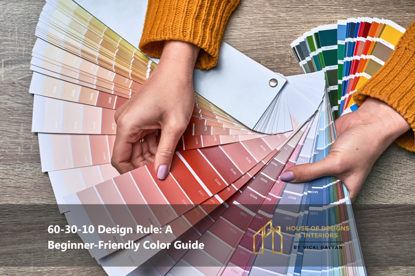
- 60% – Dominant Color
- 30% – Secondary Color
- 10% – Accent Color
Because these percentages guide how much each color should appear in a room, your space naturally looks intentional and balanced. The model works beautifully in modern, traditional, minimalist, eclectic, and transitional interiors. Since it also prevents visual clutter, it’s one of the most timeless strategies in design.
To see where this rule came from, designers have used versions of it for decades. Some trace its roots back to classical European design, while others note its presence in early color theory. Regardless of origin, the principle works exceptionally well today. (Authoritative reference for color theory: Interaction of Color by Josef Albers – https://yale.edu)
Why the 60-30-10 Design Rule Works
Although rooms can be filled with beautiful pieces, they won’t look cohesive without structure. The 60-30-10 design rule acts as that structure. Because our eyes prefer balance, the formula distributes visual weight evenly. As a result:
- Spaces feel more put together
- Rooms look professionally designed
- Colors no longer feel random
- Decisions become easier and faster
Furthermore, the method prevents overwhelm by keeping your palette simple and focused. When beginners follow this model, they immediately see more sophistication in their designs.
Understanding the Percentages in the 60-30-10 Design Rule
60% – Your Dominant Color
Your dominant color sets the mood of the room. Because it takes up the largest portion of the visual space, this shade usually appears on:
- Walls
- Large rugs
- Main flooring
- Big furniture pieces (sofas, sectionals)
Since this color guides the rest of your palette, it’s often chosen in neutral tones like beige, warm white, greige, soft gray, or cream. However, you can use deeper colors if you prefer bold design. This tone should feel calm, smooth, and consistent throughout the room.
30% – Your Secondary Color
Your secondary color supports your dominant color while adding depth and variety. Because this shade appears in medium-scale items, it creates structure without overpowering the room. You’ll typically use it in:
- Curtains
- Side chairs
- Bedding
- Cabinets
- Feature rugs
- Accent walls
This color plays the balancing role, connecting the dominant color to your accent shade. Although it can be subtle or strong, it must relate well to your primary color.
10% – Your Accent Color
Your accent color brings energy to the design. It provides the smallest color percentage but often makes the biggest visual impact. Use it in:
- Throw pillows
- Lamps
- Art pieces
- Small décor
- Vases
- Picture frames
This is where you introduce personality, fun, contrast, and uniqueness. Because the quantity is small, you can be bold without overwhelming the room.
How to Choose Colors Using the 60-30-10 Design Rule
Step 1: Pick Your Dominant Color First
Start with a color that matches the feeling you want. Light colors feel airy and calm, while deeper tones feel dramatic and cozy.
Step 2: Choose a Secondary Color That Compliments It
Select a color within the same undertone family. Warm pairs with warm; cool pairs with cool.
Step 3: Add a High-Contrast Accent Color
This is where you create excitement. Metallics, bold hues, and textured pieces work beautifully.
Step 4: Visualize the Percentages
To follow the 60-30-10 design rule, imagine the entire room in fractions. Because this helps you see the proportions, you make better decisions from the start.
Examples of the 60-30-10 Design Rule in Real Rooms
Modern Neutral Living Room
- 60%: Warm white walls and large rug
- 30%: Taupe sofa and wood furniture
- 10%: Matte black hardware and navy blue pillows
Coastal Bedroom
- 60%: Light sand-colored walls
- 30%: Soft blue bedding and curtains
- 10%: Coral and gold décor pieces
Moody Office
- 60%: Deep navy walls
- 30%: Walnut wood desk and chairs
- 10%: Brass lighting and emerald green accessories
Each example shows how the 60-30-10 design rule creates harmony across different design preferences.
Common Mistakes When Using the 60-30-10 Design Rule
Even though this rule is simple, beginners sometimes slip into a few pitfalls. Avoid these:
- Using two dominant colors instead of one
- Choosing accents that don’t relate to the palette
- Forgetting undertones
- Ignoring natural light
- Overloading with too many accents
Because following percentages keeps the palette clean, it’s important to stick closely to the 60-30-10 ratio.

Author: housedi
"Let color, form, space, texture, pattern, line, and light be your guide through the world of interior design." WE ARE MORE THAN A FRESH COAT OF PAINT.